


 |
| Gold V.1.3.1 signal Telegram Channel (English) |
Cracker Barrel’s Logo Redesign: A Bold Modern Update or a Risky Loss of Nostalgia?
2025-08-24 @ 17:01
Cracker Barrel’s Logo Makeover: Modern Strategy or Brand Misstep?
When a brand as familiar as Cracker Barrel makes a sweeping change to its iconic logo, it’s bound to draw attention—and in recent weeks, that attention has been deafening. Cracker Barrel, the American restaurant chain synonymous with country-style dining and old-fashioned hospitality, has swapped out its classic logo for a text-only version, igniting passionate reactions from fans and market watchers alike.
The Old Logo: Symbolism and Sentiment
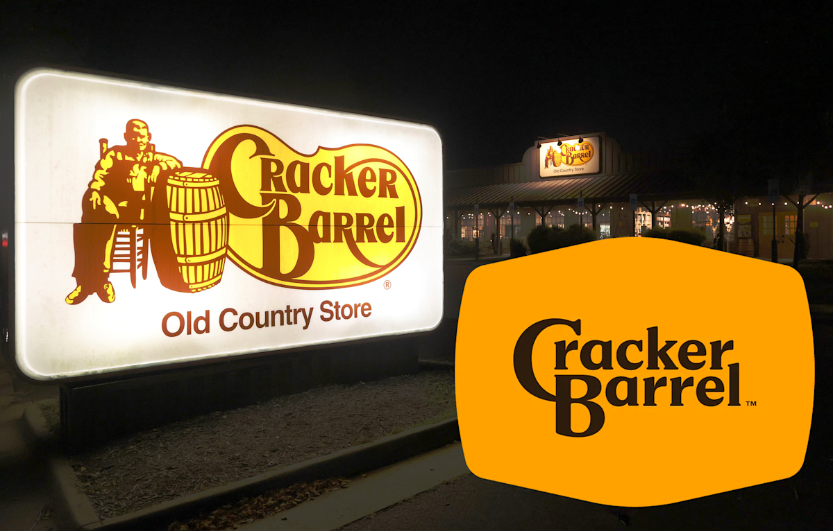
For decades, the Cracker Barrel logo wasn’t just a piece of branding; it was a vivid embodiment of nostalgia. The original design featured a man—affectionately referred to by fans as “Uncle Herschel” or the “Old Timer”—leaning on a barrel. This imagery conjured up images of rural country stores, a gathering place where stories were swapped as easily as homemade biscuits. The logo was more than aesthetic; it conveyed warmth, tradition, and a promise of comfort food in a familiar setting.
The switch to the iconic imagery happened in 1977. Prior to that, Cracker Barrel’s earliest logo in 1969 relied solely on stylized text. But that 1977 update marked the beginning of what many people now view as the “true” Cracker Barrel brand image—something so memorable it felt almost untouchable.
Why the Change Now?
In August 2025, Cracker Barrel unveiled its latest logo as part of a broader campaign to revitalize its image. This isn’t just about a visual update. The company’s “All the More” campaign aims to refresh menus, roll out remodels, and bring in more contemporary partnerships—including collaborating with country music celebrities—all part of a bid to appeal to younger customers and stay relevant in the rapidly changing restaurant landscape.
The revamped logo, however, eschews the familiar man-and-barrel vignette entirely. It’s a minimalist, text-only design—stripped down, modern, and, to many long-time fans, alarmingly generic.
Mixed Market Response: Loyalty vs. Modernization
Almost immediately after the new logo’s debut, a wave of backlash hit social media. Loyal customers and observers derided the new look as “bland,” “generic,” and even “brand suicide.” For many, the logo wasn’t just a piece of art; it represented cherished family memories and a longing for the old-fashioned values they associate with Cracker Barrel.
Some critics likened Cracker Barrel’s move to that of other legacy brands who, in an effort to modernize, lost touch with their core identity. Meanwhile, some former employees and restaurant industry watchers have called out the redesign as an erosion of brand nostalgia—a crucial asset for a company built on comforting the homesick and hungry alike.
But not everyone is up in arms. Some customers, particularly from younger demographics, appear to understand (if not praise) the move. In the eyes of branding experts, simplifying logos for digital adaptability is a modern necessity. Today’s brand marks must look crisp on screens, billboards, and social media platforms, and older, detailed logos can be harder to scale.
Cracker Barrel’s Stance
Despite the uproar, Cracker Barrel leadership insists that the heart of the company hasn’t changed. The brand continues to emphasize its commitment to hospitality and its deep country roots. Management argues that the new design actually echoes the company’s original 1969 logo, creating a “full circle” moment that both nods to its heritage and embraces the visual trends of today. They also highlight that familiar menu themes continue and that the core values behind “Uncle Herschel”—representing old-fashioned country hospitality—are still at the forefront of service in their restaurants.
Beyond Branding: Bigger Business Shifts
This design overhaul is only part of a larger transformation. Cracker Barrel has also updated restaurant interiors and diversified its menu, even venturing into selling alcohol in recent years. These efforts are responses to what Cracker Barrel perceives as long-term industry challenges: shifting demographics, changing dining habits post-pandemic, and fierce competition for the dining dollar.
Yet, financial indicators show this reinvention may not be enough. The company’s stock price took a dive following the logo reveal, signaling investor concern that Cracker Barrel risks alienating its loyal base without necessarily drawing in enough new customers to make up the difference.
The Risk and the Lesson
For legacy brands like Cracker Barrel, navigating change is like walking a tightrope. There’s a risk in letting go of the elements that built decades of loyalty, but also a risk in standing still while the market moves on. Whether Cracker Barrel’s new look will help revitalize the brand or further erode its traditional base remains to be seen.
One thing is clear, though: in a world where nostalgia is a powerful marketing tool, even small design changes can have outsized impacts—emotionally, reputationally, and financially. Cracker Barrel’s logo saga is a vivid reminder that, for some brands, history and identity can be as important as any menu item.